05 — PROJECT
LUCKY LOUNGE
ART DIRECTOR // BRAND DESIGNER
YEAR
2025–26
RELEASE
OCTOBER 2026
STATUS
PRE-RELEASE
ROLE
ART DIRECTOR // DESIGNER
CREATIVE OVERVIEW
I’ve worked with singer-songwriter Jenny JAM for over four years, developing the visual language around her music and evolving identity as an artist. For her forthcoming debut album, Trains, Planes & Airports, I’m leading the print and digital art direction across the complete campaign. Ahead of its October 2026 release, this case study offers a pre-release look at the vinyl identity and the wider visual system now being extended across merchandise, web, lead-single artwork, EPKs and press materials.

02 — CONTEXT
Trains, Planes & Airports draws on a life shaped by movement, departures and reinvention, with songs exploring resilience, independence and transformation. The album imagery originated in a Los Angeles shoot by photographer Anna Azarov. One particular portrait, set within a circular concrete structure, became the starting point for an identity that needed to work across both physical and digital formats.


03 — APPROACH
The first direction paired a warmer portrait with handwritten yellow typography, creating a softer and more conventional pop identity. I moved towards the circular concrete portrait because its architecture reflected the album’s themes of movement, repetition and transition. A stripped-back monochrome treatment, vivid pink type and restructured two-line logo gave the final direction greater tension, clarity and individuality.


05 — PROCESS
The selected portrait was tightly framed and not suitable for a square record sleeve or continuous wraparound layout. I used Photoshop Generative Fill, powered by Adobe Firefly, to expand the concrete environment across the front, spine and back cover.
The tool accelerated the initial canvas expansion, but its outputs introduced colour noise, softened the concrete texture and struggled to maintain continuity across larger areas. I evaluated each result for realism, texture continuity and focal hierarchy, then manually rebuilt seams, composited source fragments, corrected the tonal treatment and completed the typography and production artwork.
04 — VISUAL SYSTEM
The identity is built around the contrast between distressed concrete, a stripped-back monochrome palette and vivid pink typography. The reworked two-line Jenny JAM logo creates greater rhythm and presence, while the system extends across the outer sleeve, spine, centre labels and printed insert.
This visual language now provides the foundation for the wider album campaign. It is being adapted across merchandise, the artist website, lead-single artwork, electronic press materials and promotional assets while maintaining a consistent and recognisable identity.

06 — SOLUTION
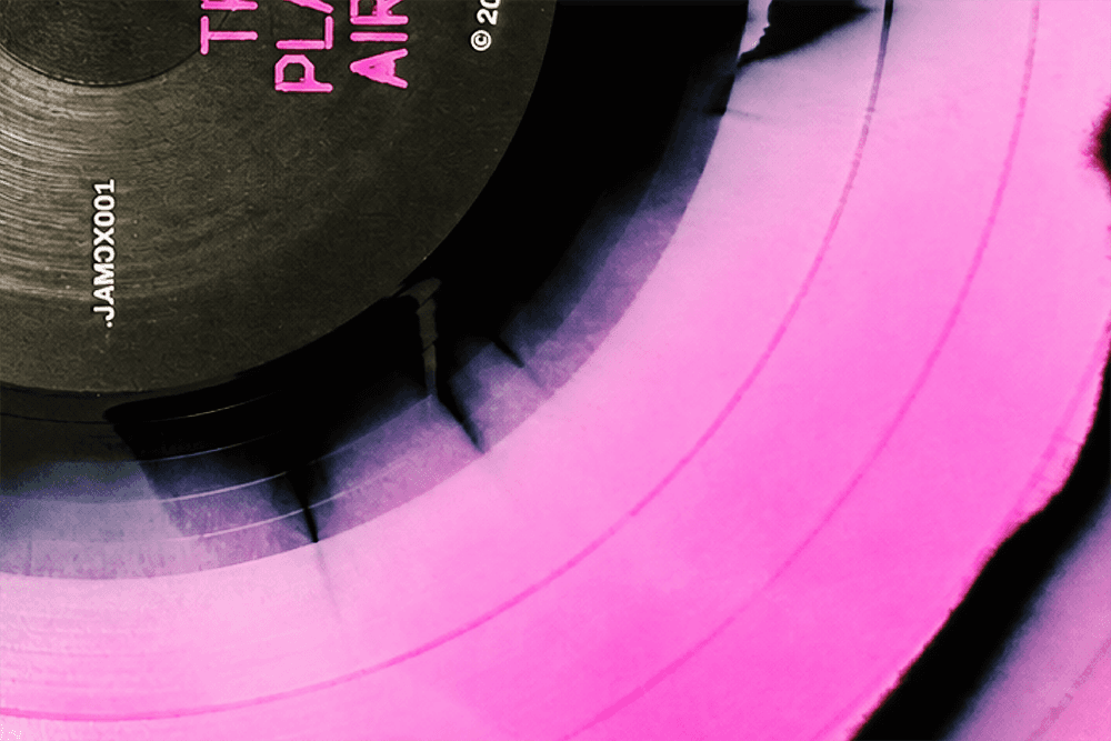
The initial vinyl concept used a precise neon-pink, black, and white marble pattern, but this could not be replicated exactly through coloured PVC manufacturing. Working with Breed Media, I reviewed achievable combinations and adapted the concept to the physical behaviour of the material. The final pressing combines magenta and black PVC naturally, giving every record in the limited run its own unique pattern while retaining the energy of the original digital idea.
07 — OUTCOME
The first major output of the campaign is a complete, production-ready vinyl system spanning the sleeve, spine, centre labels and printed insert. The artwork was developed and prepared for production during 2025, with Breed Media manufacturing a limited run of 250 records, each featuring an individual pressing pattern.
The vinyl establishes the creative foundation for the album’s October 2026 release rather than functioning as a standalone cover. As the campaign develops, the same identity will connect every physical and digital touchpoint into one coherent visual world.
